Take A Fresh Look At Music
The advent and development of Web 2.0 brought a huge amount of musical metadata into the public domain, and this in turn sparked off a number of interesting data visualisation projects. I previously posted on Lee Byron’s Last FM listening history chart, but a recent report at Smashing Magazine covers some other sites that take raw data and present it in new and sometimes pulsating ways…
- The Shape of Song takes MIDI input of a composition, analyses it and graphs the underlying musical structure as a series of translucent arcs.
- Musiclens a variation on the theme of mood-based music organisation and representation.
- Fidgt Visualiser uses a combination of Last FM and Flickr data to group similar items using ‘magnets’.
- Musicmap uses metadata to create connections between artists, creating a web-like framework.
- Musicovery follows a similar format, creating connections between artists and allowing you to discover new artists based on broader socially-driven linking patterns.
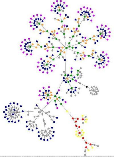
Another interesting visualisation featured here is the Web site structure visualiser developed by Aharef. This allows you to view a site’s structure as a colourful fractalesque entity whose complexity depends upon the number and variety of html tags present on your pages. To illustrate this, here’s how the Podcomplex home page looks:
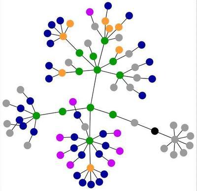
Simple enough really. Blue elements represent links, green is for DIV tags, black is for the HTML tag itself, and red is for tables – check out Aharef for the full legend. However, as your page develops and expands, the graph will become more complex, as can be seen when the generator renders the Podcomplex blog: